
Room addition mistakes to avoid: layout, rooflines, and flow
Most room addition regrets don’t come from “bad intentions.” They come from small design oversights that seem harmless on paper—until you live with them every day.
This mistakes-to-avoid guide is built for Utah homeowners planning an addition and searching for room addition mistakes to avoid, addition layout flow problems, home addition roofline mistakes, and addition mechanical planning. We’ll highlight the most common missteps and give you a practical room addition checklist to prevent expensive rework.
In this guide, you’ll learn:
- how to spot circulation and flow issues before permit drawings,
- roofline and ceiling integration mistakes that create awkward interiors (or leak risk),
- exterior alignment errors that make an addition look “tacked on,”
- mechanical and electrical planning misses that hurt comfort,
- window placement pitfalls that affect privacy and daylight,
- and how to build future flexibility into the layout.
The Fortress Builders is a Utah design–build company built on one principle: strength through structure. That means we coordinate layout, structure, permitting, and build execution from the beginning—so your addition feels original to the home, not like an afterthought.
Helpful pages while you plan:
Most addition regrets start with design oversights—not construction
When an addition “doesn’t feel right,” the root problem is usually not craftsmanship. It’s the plan: how you enter the space, how it connects to the rest of the home, where the ceiling drops, where the windows face, or how mechanical systems were forced into tight corners.
The good news: these mistakes are predictable. And that means they’re preventable—if you know what to look for before drawings are finalized.
Core idea: Additions should solve a daily-life problem. If the plan creates new friction—awkward circulation, poor privacy, uncomfortable temperatures—you’ll feel that friction every day.
Mistake #1: Designing the new room without mapping real-life circulation
This is the most common source of addition layout flow problems. A room can be beautiful and still feel wrong if the way you move through it is awkward.
What this mistake looks like
- You walk through the new room to reach another space (it becomes a hallway).
- Door swings collide with furniture zones or traffic paths.
- A new opening creates a “pinch point” where people bunch up.
- The room has no clear “anchor wall” for furniture placement.
How to prevent it
Flow check (do this before drawings are finalized):
- Walk the route: entry → seating/work zone → exit. Does anything feel forced?
- Mark “no-furniture” circulation paths (especially to bathrooms, kitchens, and stairs).
- Identify the anchor wall (TV, fireplace, bed headboard, built-ins, etc.).
- Check door swings and clearance around corners.
- Plan at least one flexible wall for future layout changes.
If the addition is part of a larger renovation, sequencing and traffic planning matter. See Whole-Home Remodel Sequencing for how pros prevent trade overlap and rework.
Mistake #2: Adding square footage but not improving how the home works
Some additions technically add space—but don’t reduce daily friction. That can happen when the plan ignores storage, drop zones, and transitions between “messy” and “clean” areas.
Examples
- A bigger family room with nowhere to store games, blankets, or devices.
- A new bedroom with no closet strategy (or awkward closet placement).
- An expanded kitchen without improved work zones or pantry planning.
Prevent it by designing “support space”
Support space isn’t glamorous, but it’s what makes a home feel calm. If your addition touches the kitchen, these guides help you plan the right kind of function:
- Work Triangle vs. Work Zones
- Pantry Design Ideas: Walk-In vs. Cabinet Pantry vs. Butler’s Pantry
- Kitchen Island Size Guide: Clearances, Seating, and Storage
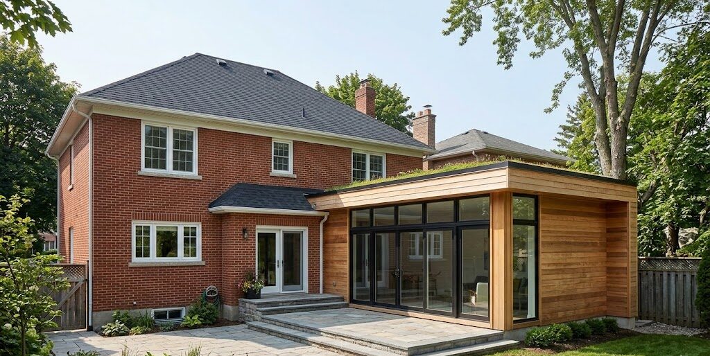
Mistake #3: Roofline and ceiling integration issues (the “why does this feel low?” problem)
Home addition roofline mistakes are often invisible in early drawings because homeowners focus on floor plans. But ceiling transitions and roof geometry can make a new room feel cramped—even if the square footage is generous.
What this mistake looks like inside
- Unexpected soffits or ceiling drops where ducts/beams were forced through.
- Ceiling heights that don’t align with the rest of the house.
- Odd transitions that make the room feel like a conversion instead of a true addition.
What it looks like outside
- A roof tie-in that creates awkward valleys or water-trap conditions.
- Misaligned fascia/eaves that make the addition look “tacked on.”
- Window head heights that don’t match existing elevation rhythm.
Roofline reality: A “simple” addition can get expensive if the roof tie-in becomes complex. It’s not just aesthetics—it’s durability and water control.
Want a clearer picture of the structural and tie-in factors that affect real budgets? See Home Addition Cost Drivers in Utah.
Mistake #4: Mechanical planning as an afterthought
This is the most costly category of addition mechanical planning mistakes. If HVAC, electrical, and plumbing routes are not planned early, they get routed wherever they “fit,” and the room pays the price in soffits, noise, hot/cold spots, or limited lighting options.
HVAC mistakes that create comfort problems
- No return air strategy (supply-only rooms often feel stuffy or unbalanced).
- Thermostat placement that doesn’t represent the new load.
- Duct runs forced into tight cavities, creating bulkheads.
- Undersized or unbalanced airflow causing hot/cold zones.
Electrical and lighting mistakes
- Outlets placed where furniture blocks them.
- No plan for layered lighting (task + ambient + accent).
- Too few circuits for future flexibility (office, gym, appliances).
Mechanical planning checklist:
- Where will supplies and returns go for balanced airflow?
- How will ductwork route without dropping ceilings?
- Do you need zoning or a system capacity upgrade?
- Where will lighting layers be: overhead, wall, accent, task?
- Are outlets and switches aligned with furniture placement?
- Are future loads anticipated (EV charger, office equipment, kitchenette, etc.)?
For airflow and comfort principles that apply broadly (even beyond basements), see Basement HVAC & Ventilation Planning. The concepts of supply/return balance and humidity control are universal comfort fundamentals.
Mistake #5: Window placement that sacrifices privacy, daylight, or furniture options
Windows do more than “let light in.” They set privacy boundaries, determine furniture placement, and shape how the room feels throughout the day.
Common window placement errors
- Large windows facing direct neighbor sightlines (privacy regret).
- Window heights that conflict with headboards, desks, or built-ins.
- Over-glazing without considering heat gain/loss and glare.
- Under-glazing that leaves the room dim and reliant on overhead lighting.
Better questions to ask
- Where will the furniture actually go? What walls need to stay solid?
- What direction does the room face (morning glare vs afternoon heat)?
- What is the privacy reality from the street and neighbors?
- Do you want “view windows” or “light windows,” or both?
Design tip: In many additions, a few well-placed windows feel better than “more windows everywhere.” Daylight should support comfort, not create glare and privacy stress.
Mistake #6: Exterior alignment issues that make the addition look “tacked on”
Homeowners often focus on the interior experience (understandably). But exterior alignment is where resale value and long-term pride show up.
What “tacked on” looks like
- Mismatch in window proportions or head heights.
- Different trim thicknesses, siding reveals, or inconsistent corner details.
- Roof lines that don’t relate to the original home’s geometry.
- Awkward steps or grade transitions at the addition perimeter.
If you want to see how a cohesive design approach can keep additions feeling integrated, explore Whole-Home Remodel Portfolio and Modern Remodel Portfolio for examples of clean, intentional exterior rhythm.
Mistake #7: Forgetting future flexibility (today’s perfect room becomes tomorrow’s problem)
The best additions serve the current need and adapt later. That’s especially true for families, aging parents, remote work changes, or future resale.
Simple flexibility wins
- Extra storage or a closet where it could become a bedroom later.
- Electrical planning that supports changing uses (office ↔ guest room ↔ hobby).
- Doorway placement that allows furniture reconfiguration.
- Sound and privacy considerations for future occupants.
If your addition may eventually support multigenerational living, you’ll likely find helpful planning concepts in Basement In-Law Suite Planning: Privacy Zones, Storage, and Comfort.
Mistake #8: Rushing into permit drawings before doing a real design review
Once drawings are submitted and approvals start moving, changes get harder. That’s why a structured design review is one of the best investments you can make.
What a “design review” should confirm
- Flow: circulation, door swings, furniture zones, anchor walls.
- Ceiling/roof: soffit risk, ceiling heights, roof tie-in approach.
- Exterior: window rhythm, siding/trim continuity, elevation alignment.
- Mechanicals: HVAC supply/return plan, lighting layers, outlet locations.
- Future: flexibility for changing household needs.
- Sequence: how the project will be staged to reduce rework.
For process and expectation setting, these pages can support planning conversations:
Room addition checklist: a quick pre-permit “mistake prevention” scan
- Flow: Is the room a destination—not a hallway?
- Furniture: Do you have an anchor wall and realistic furniture zones?
- Doors: Any door swing collisions or pinch points?
- Ceiling: Any likely soffits or ceiling drops from ductwork/structure?
- Roofline: Is the roof tie-in clean and durable (not overly complex)?
- Exterior: Do window head heights and trim rhythm match the home?
- HVAC: Balanced supply and return plan? Comfort strategy?
- Electrical: Layered lighting and outlet placement aligned with use?
- Privacy: Window placement respects neighbors and street views?
- Future: Could the room adapt to a different purpose later?
Conclusion: the best additions feel inevitable—not added on
A great room addition doesn’t just add square footage. It improves how the home works, aligns with the home’s structure and exterior rhythm, and stays comfortable year-round.
If you want to avoid regret, don’t rush into permit drawings. Do a structured design review that tests flow, rooflines, mechanical planning, and future flexibility. That single step prevents many of the most expensive mistakes homeowners face.
Planning a room addition in Davis or Weber County?
The Fortress Builders can review your concept, identify common design pitfalls, and help you refine the plan so your addition feels cohesive, durable, and comfortable—before drawings get locked.
Request a Design Consult Explore Additions & Expansions
Bring your rough sketch, inspiration photos, and must-haves. We’ll help you pressure-test the plan before it becomes expensive to change.